5 Examples of well designed annual reports
It seems like brands are being more creative with their annual reports every year.
What is an annual report?
An annual report is a comprehensive booklet that discloses a company's activities over the past year with the goal to inform shareholders and stakeholders regarding financial performance.
I found 5 annual reports that I think did a great job bringing some creativity to their annual reports!
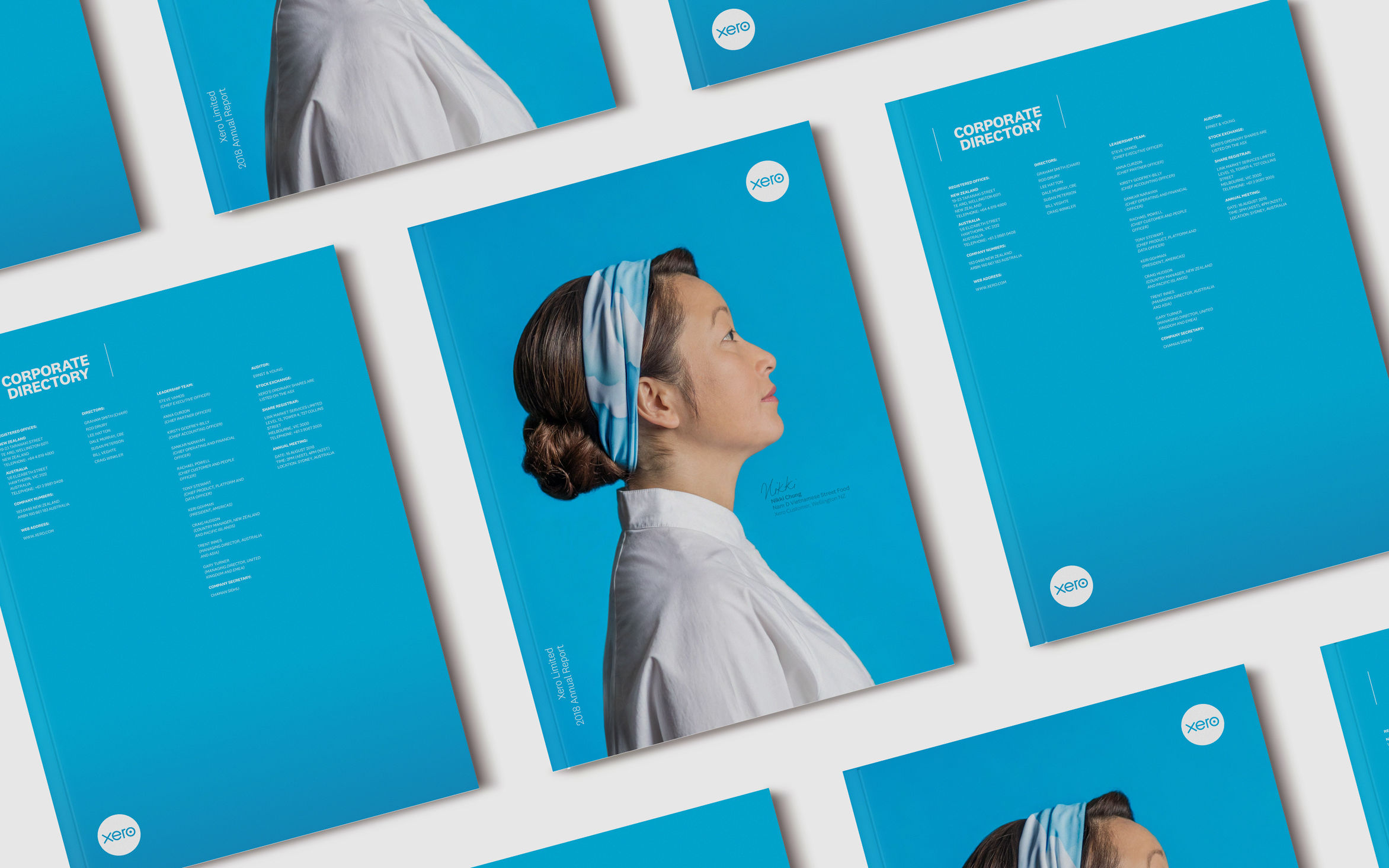
Minimalism at its best! This is how I would describe the annual report Xero put out for 2018. The colour scheme is amazing, the images are sharp and funny. The combination of bold numbers and interesting data makes this report stand out from the crowd.
They have a web version that is basically a one page website and a PDF version that looks just fabulous.
It is obvious the brand put some effort in presenting their annual report this year. The brand identity is on point and the over all look and feel is pleasant.
Not only they created a PDF for the annual report but they translated the information into an interactive web version. I love seeing some interactive elements in the web version.
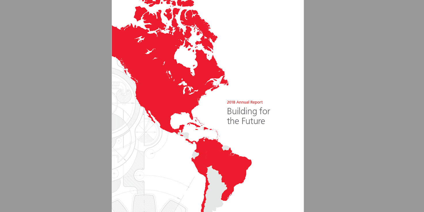
Although it is just a PDF, the design is spotless. The colour combination is amazing and the data visualization is on point.
This annual report is the perfect examples how a data heavy document can still look great and can be easy to follow. The aesthetics of this document completely reflects the brands professionalism.
This annual report also adopts a minimalist approach and combines data visualization and flat illustrations.
I am more than happy to bring design to your next creative annual report.
Mailchimp created an infographic as an annual report that made waves in the creative industry.
If you are interested in creating an infographic for your next annual report, you can start with this template:
ANNUAL REPORT INFOGRAPHIC TEMPLATE
ANNUAL REPORT TEMPLATE


