
Wait Time Tool
Wait Time Tool UX Design
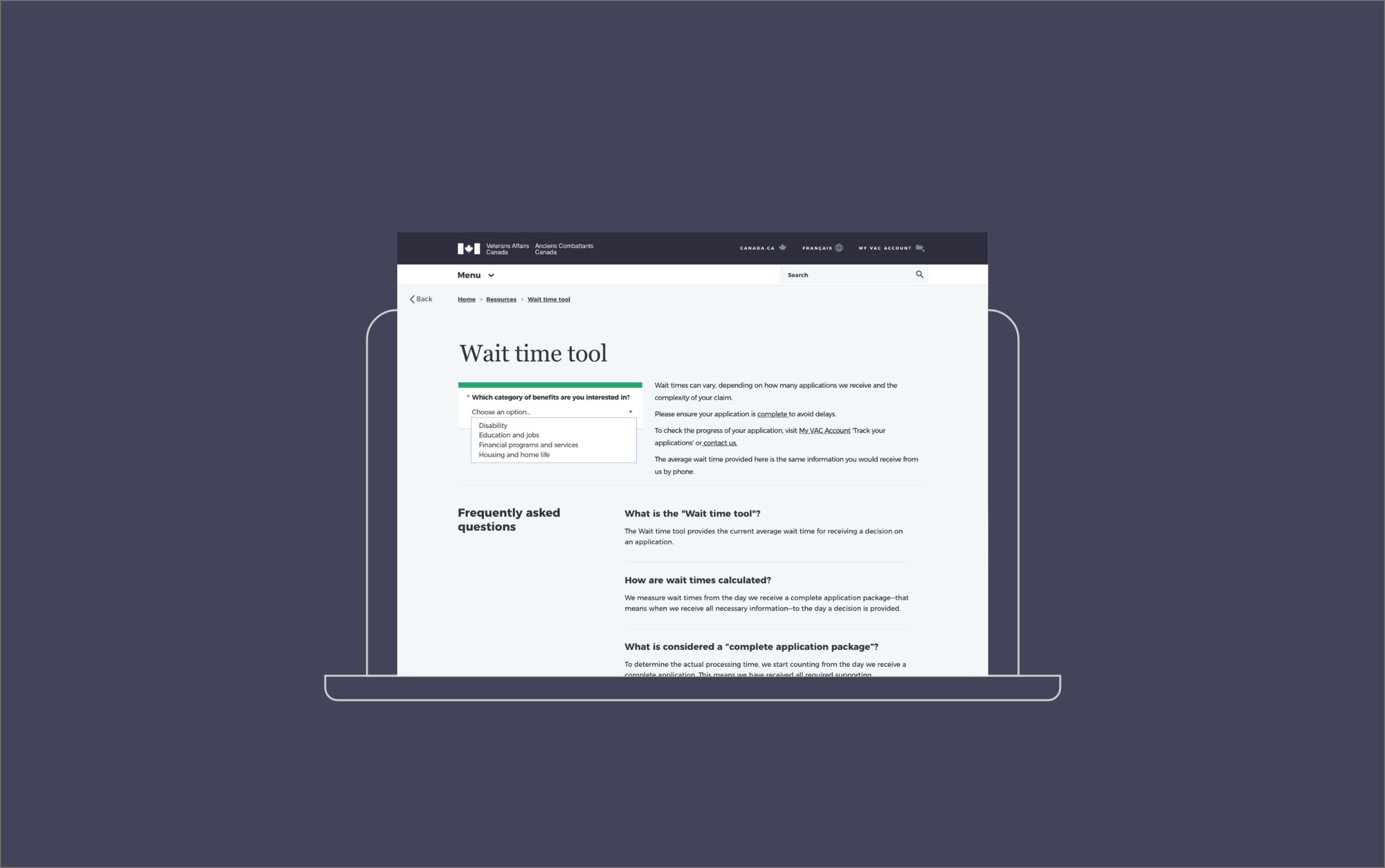
Wait Time Tool
UX/UI Design For Veterans Affairs Canada
The Wait Time Tool is an online tool for Canadian Veterans who applied for benefits and it provides the current average wait time for receiving a decision on an application.
Project duration: January 2019-November 2019
Role: UX/UI Designer
Responsibilities:
Discovery work, Qualitative and Quantitative Research, UX Design, Prototyping, Wireframing, Documentation, Presentation to Stakeholders, Delivery.
Team:
Business Analyst
Project Manager
UX Designer
Data Analyst
Copywriter
Interviewer
© Veterans Affairs Canada
Problem
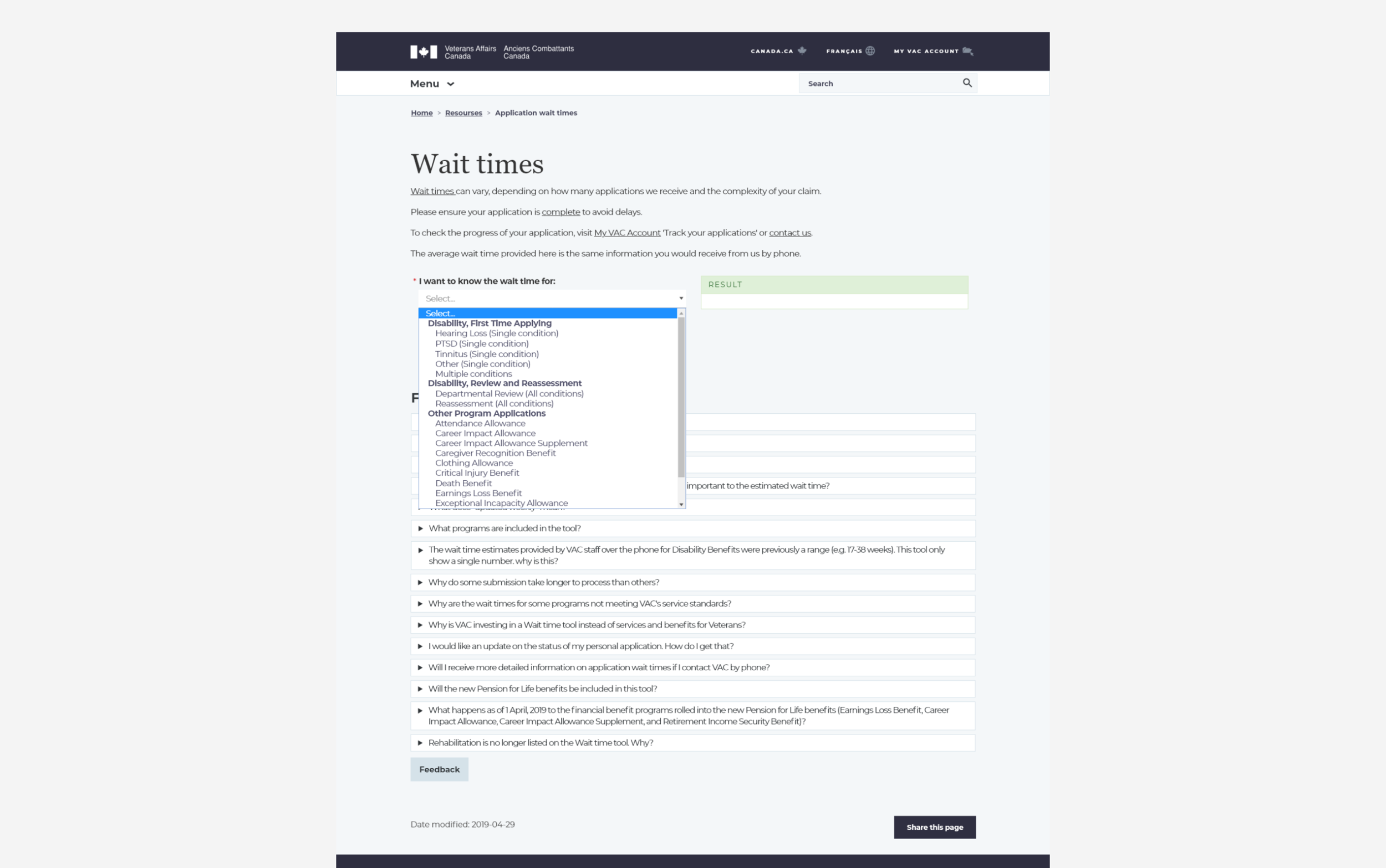
The list of benefits is too long. Users have to scroll, read every single benefit in order to select the one that fits their needs.
This activity takes a lot of time and can be strenuous for users with disabilities.
Users were not sure what to do after they checked their application wait time and their application took too long.
Users didn’t trust or understand how the wait times were calculated. They felt there was a transparency issue.
The naming of the Benefits displayed in the dropdown didn’t match the internal or the external naming. The codes associated with each benefit did not always coincide either.
Solution
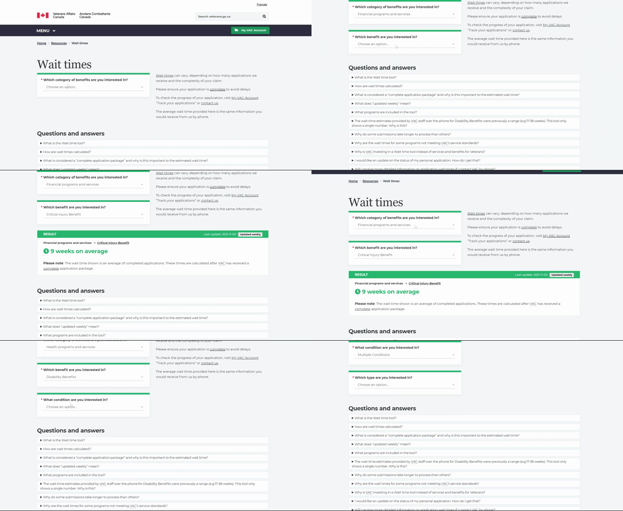
Create a guided experience to reduce the amount of errors users would make while trying to find the benefit that fits their needs.
Change the copy around what the next steps are and make it more obvious on the page.
Connect the data used for calculating the Wait Times to the Open Government website, for public knowledge.
In collaboration with the business manager, I decluttered and organized the list of benefits. Their naming and the codes associated in the database all match the internal and external website.
Research
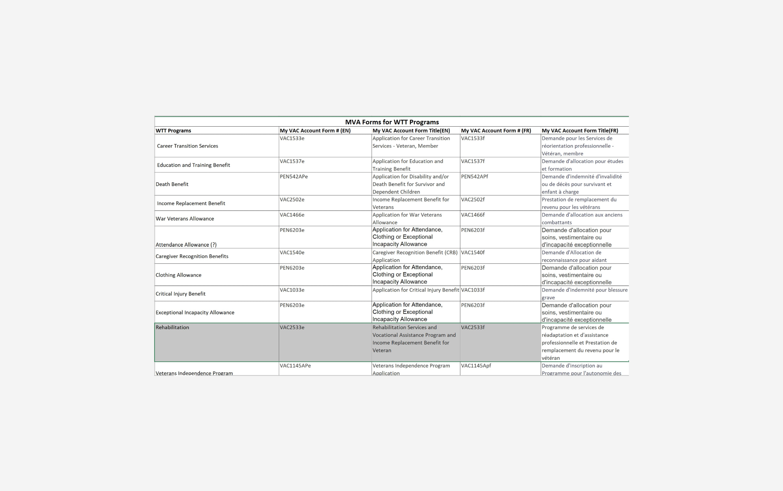
I gathered all the benefits existent on the public website, then I compared their naming with what we had in the database and in the internal tool “MyVac Account”. We noticed slight discrepancies in naming and the codes used in our database.
We also looked at the benefits with the highest approval rate in order to get an idea of which benefits the users would select the most.
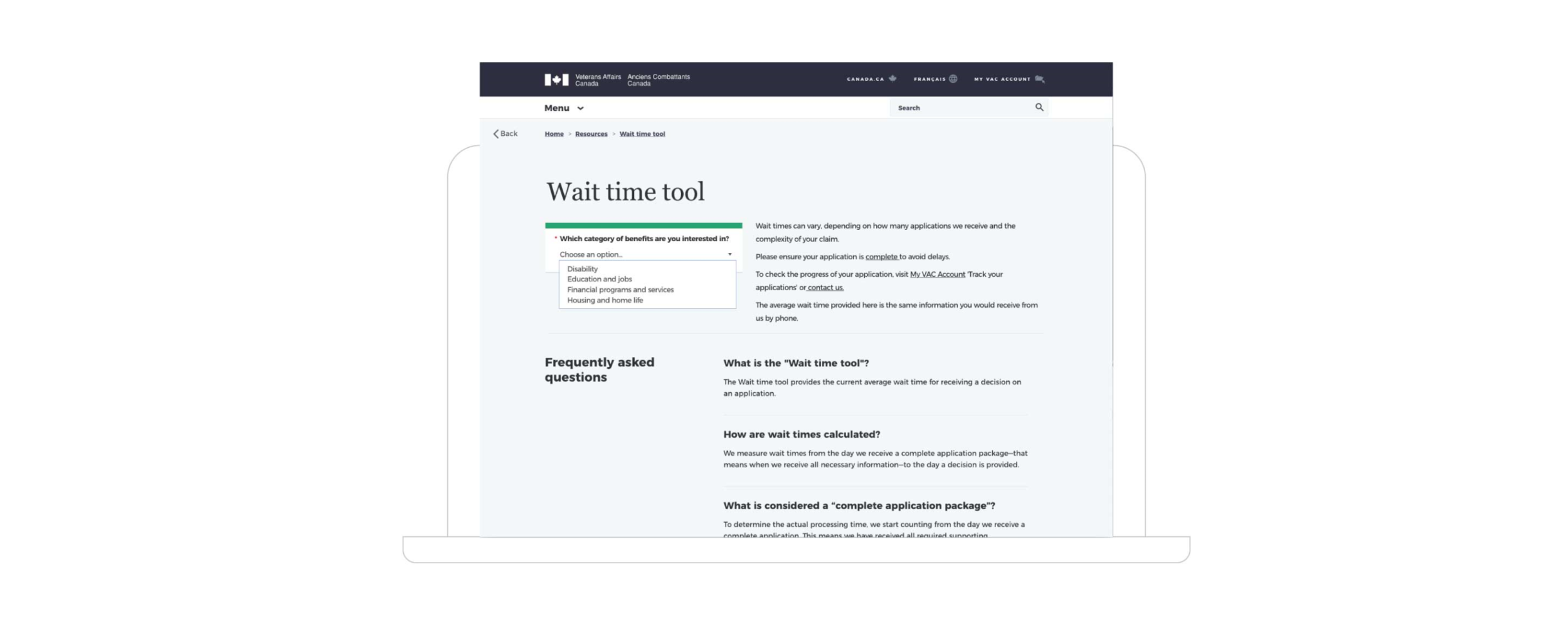
We noticed that the “Disabilities” application was leading so I had to look at ways to make it easy to find in the dropdown.
Usability Testing
5 out of 6 had no difficulty finding the benefit they were looking for.
5 out of 6 users found out what they need to do if their application takes longer than the displayed result.
3 out of 6 users found the “Open Government” data and one of them had difficulties accessing it.
Prototyping
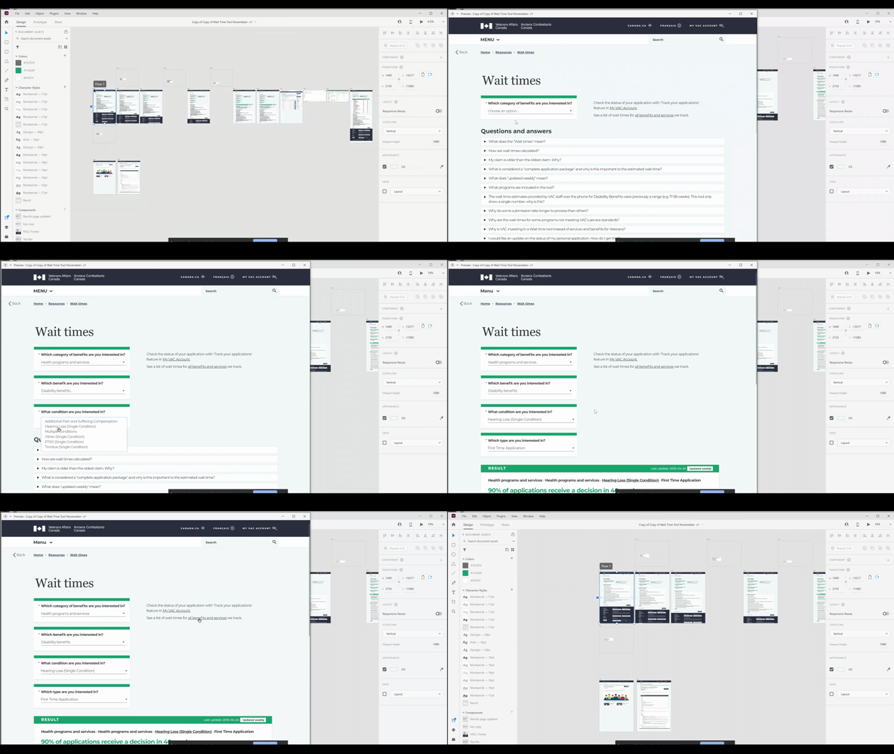
A high-fidelity prototype was created in Adobe XD
Collaborate
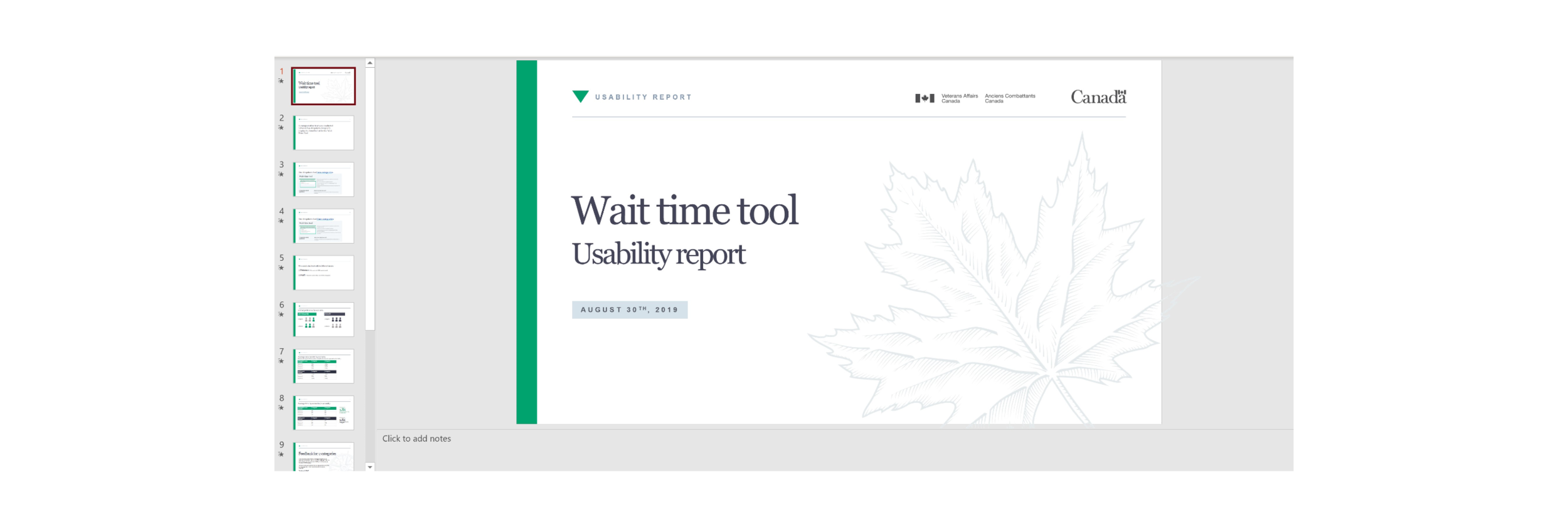
I made sure the team was up to date on the usability results and any research and development of the product.
The team collaborated closely to bring the tool where it is today.